My Top Paint Colors for Low Country Interiors + Free Download!

Let’s talk about paint - one of the most powerful tools in a design toolbox. I love the many possibilities that paint offers. Are you longing to change up your interiors and need a place to start? Do you want to start fresh with a new paint color in your home? Or, are you interested in making a statement with your paint colors?
I’ve put together a list of my favorite shades across a few different paint brands.
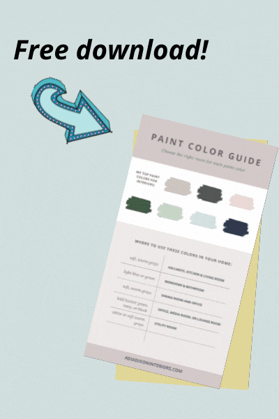
There’s also a free downloadable cheatsheet that shows you my favorites and gives you the basic tips you need to know about picking your paint color. Click the button below to get the free download!
Repose Gray by Sherwin-Williams
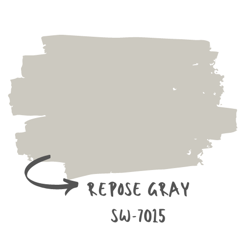
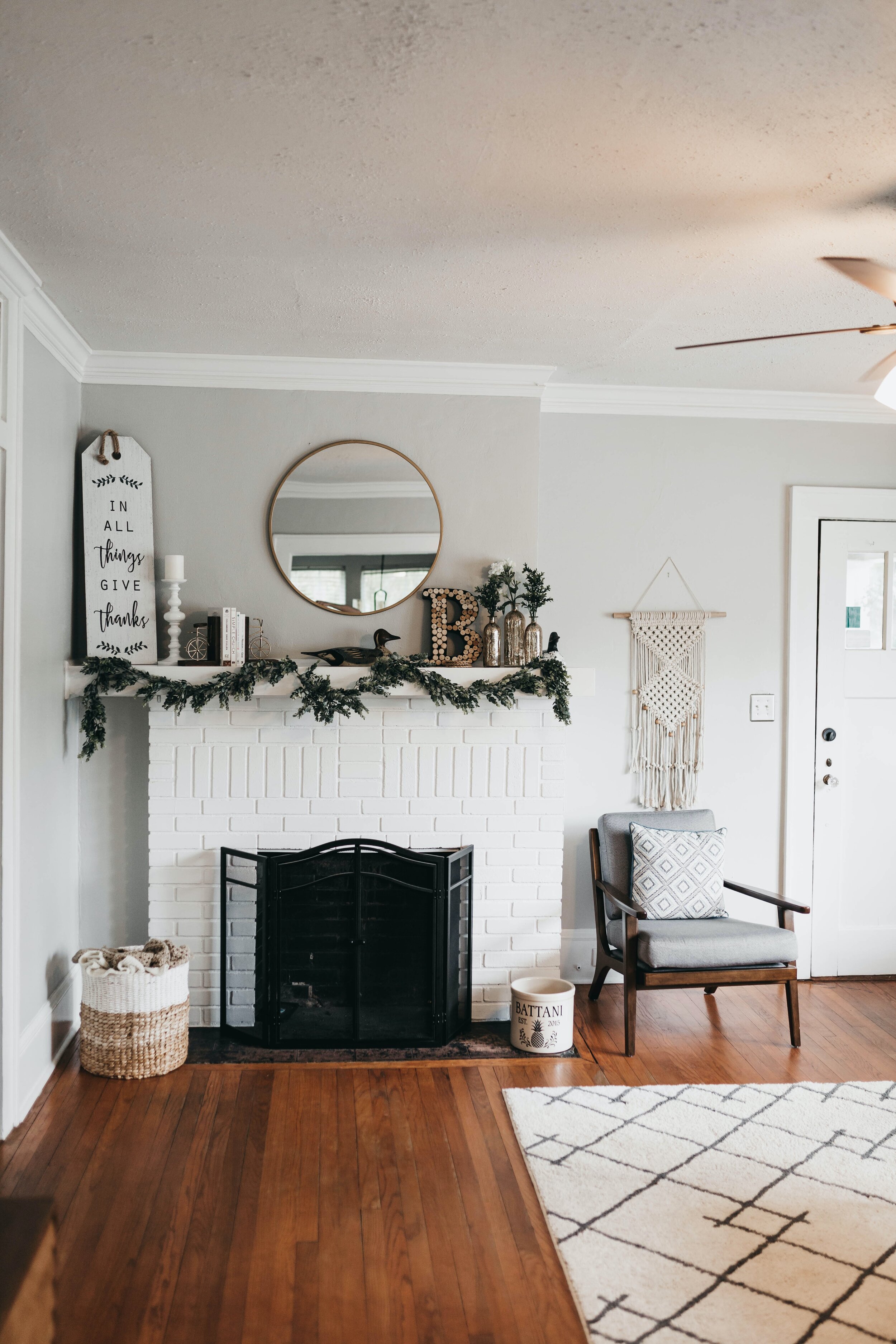
Repose Gray is my absolute favorite gray paint color. It’s soft, yet not too bright, and warm, without a tinge of pink or yellow. Repose Gray is a beautiful backdrop to any home. On the walls, it creates a neutral palette to work off of, while on furniture, it brings elegance to the space like a string of pearls. I love to see Repose Gray styled with lighter wood tones and white accents, like the white quartz countertop and the neutral stoneware shown in the photo below. It’s also a great contrast with charcoal gray or black accents, like black photo frames or dark, minimal, and modern lighting fixtures.
SIMILAR SHADES FROM OTHER BRANDS:
Elephant’s Breath by Farrow & Ball
Repose Gray makes a great cabinet color and plays well with wood tones and brass hardware.
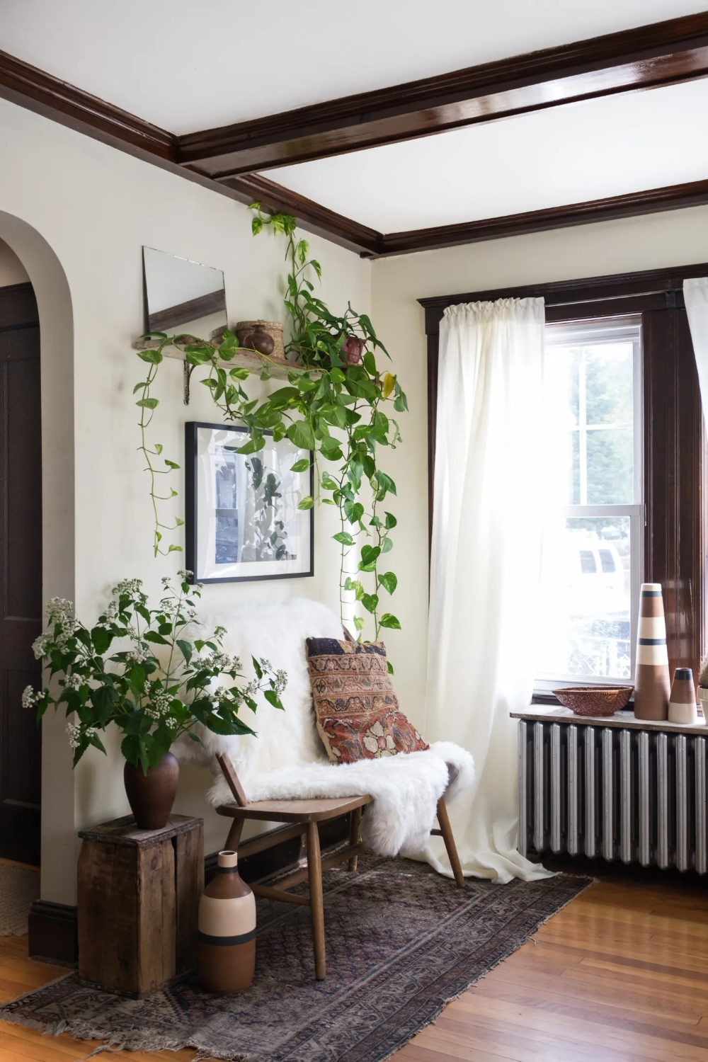
A bright and welcoming foyer with walls painted in Sherwin Williams Repose Gray. Image Source: Thrifty Decor Chick
Peppercorn by Sherwin-Williams
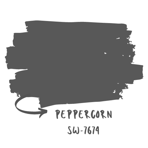
On another end of the spectrum is a bold, deep charcoal color with just the right amount of warmth. Sherwin-Williams’ Peppercorn hits all of the right notes when you want to make a statement, but is relatable enough to be paired with whites, neutrals, and pops of color.
SIMILAR SHADES FROM OTHER BRANDS:
Iron Mountain by Benjamin Moore
Off-Black by Farrow & Ball
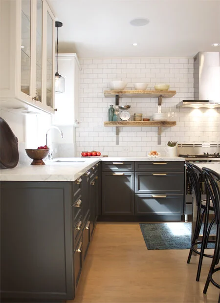
Sherwin-Williams’ Peppercorn goes so well with sleek shaker-style cabinets, brass hardware, and crisp, white subway tile.
This living room is coastal, comfy, and makes a great first impression. Image Source: Studio McGee
Naval by Sherwin-Williams
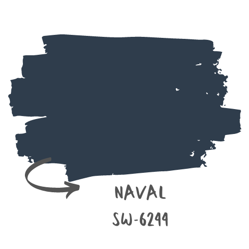
Naval is just as dramatic as Peppercorn, but it has that quintessential Coastal feeling because it references back to nautical hues. It almost has a little more of a formal mood — when paired with brass or nickel hardware and wood tones, this paint color reminds me of pictures of my dad in his Dress Blues when he served in the Navy.
Naval is one of those paint colors that acts as a neutral even though it is so boldly blue. You can pair it with red-toned woods and cream fabrics. I love seeing Sherwin-Williams’ Naval paint color styled with Polished Nickel hardware and Copper metal accents.
SIMILAR SHADES FROM OTHER BRANDS:
Hale Navy by Benjamin Moore
Stiffkey Blue by Farrow & Ball
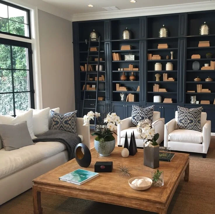
The built-ins in this photo create a structured, formal living room. Image Source: Williams-Sonoma
Gray Cashmere by Benjamin Moore
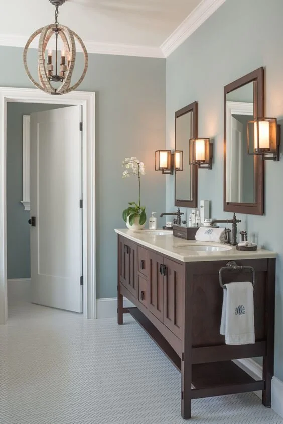
Gray Cashmere by Benjamin Moore is my all-time favorite soft gray-green. It instantly has such a soothing and peaceful effect on your interiors. Being that it is such a soft color, I love seeing it contrasted with dark woods and copper tones. It also looks great in any space from living and dining areas, to bathrooms, offices, and bedrooms. Gray Cashmere is one to look out for because of its subtle and soft beauty.
SIMILAR SHADES FROM OTHER BRANDS:
Sea Salt by Sherwin-Williams
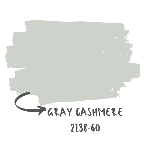
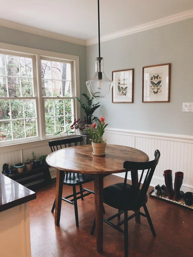
Image Source: u/troubleshootsback on Reddit
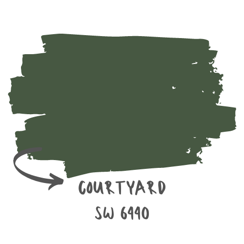
Courtyard by Sherwin-Williams
Since my favorite color is green, you could say that I’m biased when it comes to green in interiors. I love anytime that green can be incorporated for a sophisticated and fresh look. To evoke that mood, I love using a green like Sherwin-Williams’ Courtyard in kitchens and bathrooms, or wherever you want to bring the outside in.
Courtyard is a slightly more olive tone that also gives a space a more industrial, vintage look. For this reason, it works as a playful backdrop in offices, guest rooms, and powder rooms, or wherever warm wood tones are present.
SIMILAR SHADES FROM OTHER BRANDS:
City Arboretum by Valspar
Duck Green by Farrow & Ball
Forest Floor by Benjamin Moore
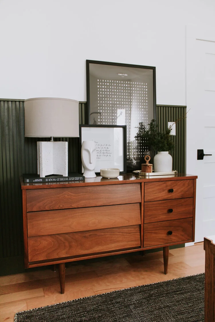
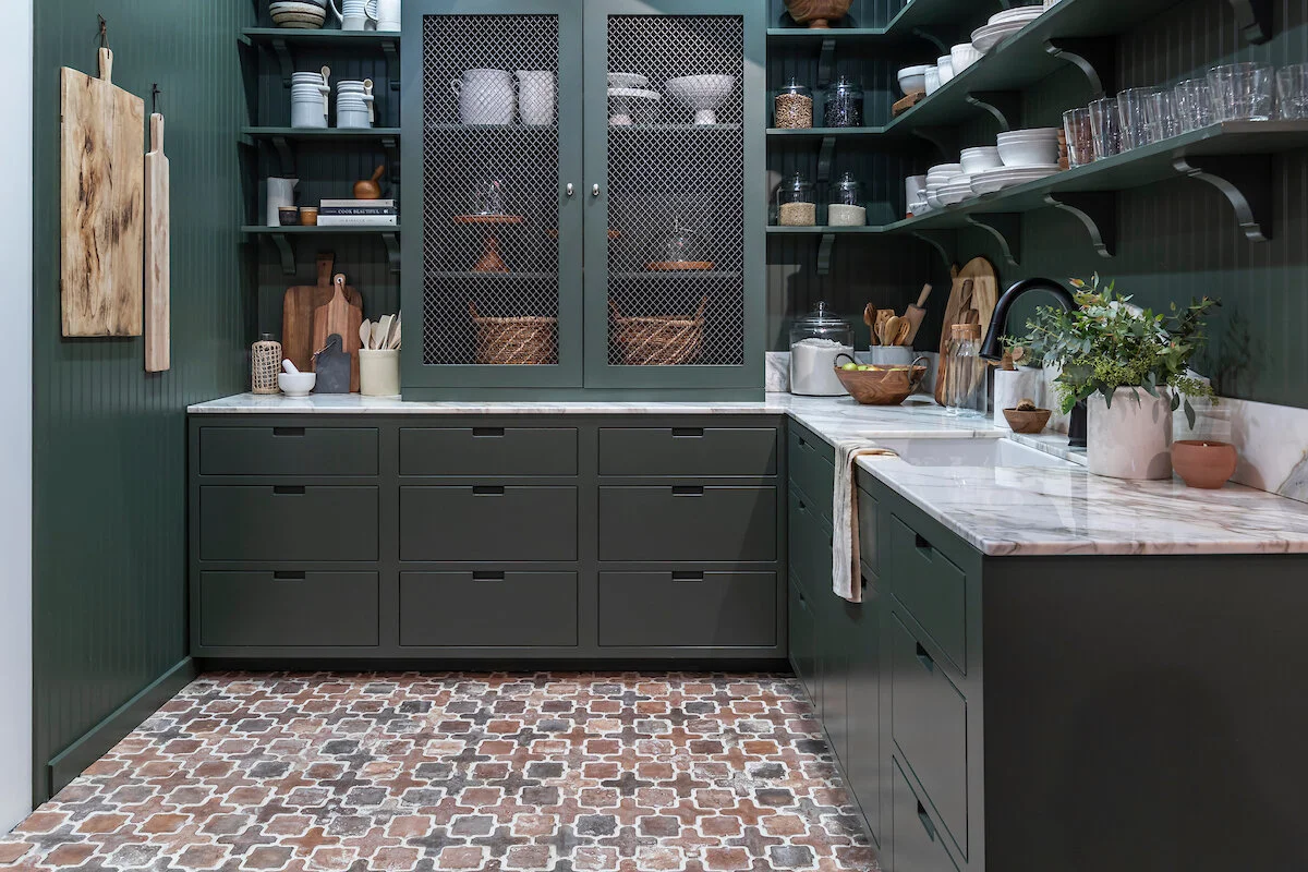
Image Source: Nadine Stay
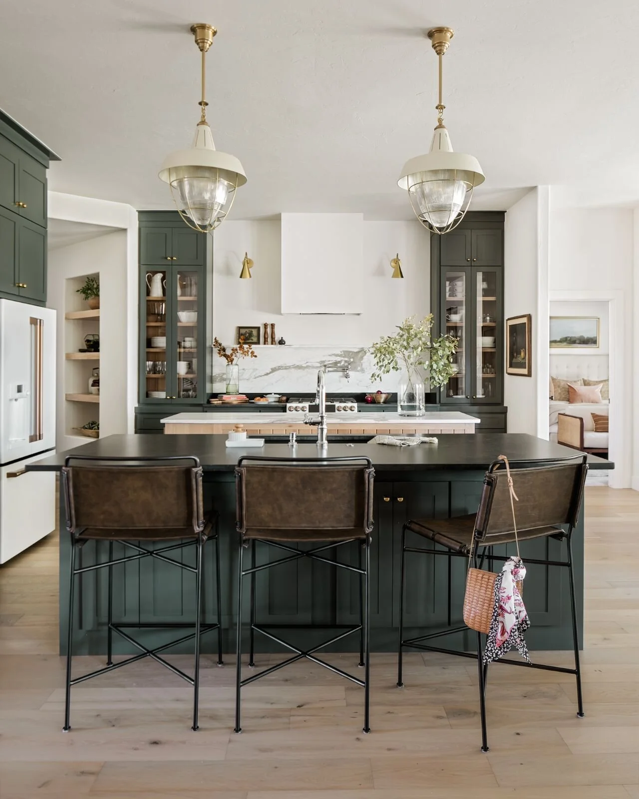
Image Source: Kelsey Leigh Design Co.
Melted Ice Cream by Benjamin Moore
Okay, okay. Hear me out — I know pink definitely had its day back in the ‘70’s and ‘80’s, but this newer shade of pink, Melted Ice Cream by Benjamin Moore is still all the rage. Aptly named “Millennial Pink”, this toned-down blush shade can be a fun backdrop to any flex space, office, or little girl's’ bedroom.
SIMILAR SHADES FROM OTHER BRANDS:
Hush White by Sherwin-Williams
Naivete by Valspar
Peignoir by Farrow & Ball
Image Source: Domino
Image Source: Studio McGee
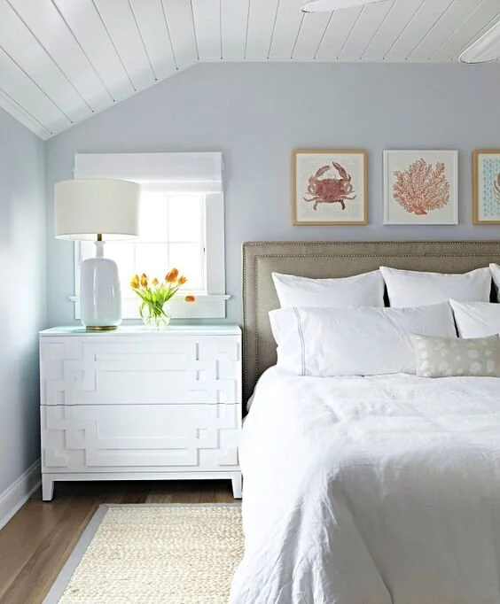
Beacon Gray by Benjamin Moore
Absolutely nothing says “coastal cottage home” like a pale true blue. Beacon Gray is soft like a cloud but still references back to the open waters of the Low Country at the beach or nearby marsh. This blue is very light and airy, and works well with soft shades of tan and gray. Think of sand, shell, and white for your coordinating décor.
SIMILAR SHADES FROM OTHER BRANDS:
Icelandic by Sherwin-Williams
Ammonite by Farrow & Ball
Gentle Sea by Behr
Here’s a free download!
Get a free printable cheatsheet you can take with you to the paint store! It’ll be handy for noting the top lowcountry paint colors and a quick guide on where to use them in your home!
Just enter your email and you’ll get the download immediately!
Thanks for reading,